Design Conflicts in Messenger Day
Originally written in 2017 for the Quora design blog.
Last week Facebook Messenger rolled out Day, their take on the Snapchat Stories format. This release comes roughly a year after Instagram did the same thing, which appears to have quickly become a major hit in spite of Snapchat’s traction [1]. Day is nearly identical to Instagram Stories, and yet the initial impressions I’ve encountered are almost uniformly negative [2].
What explains this striking difference? There are many factors, but I’d like to zoom in on one element of the interface, the row of new “days”, and then I’ll back out to more fundamental factors.
Intrusion
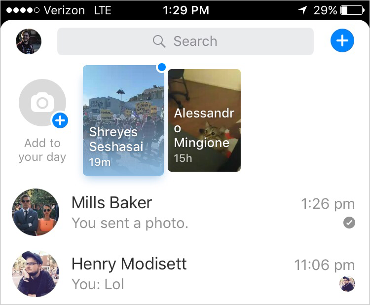
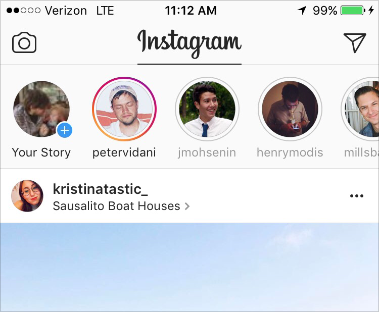
At first glance, Messenger’s UI seems to depart only slightly from Instagram’s, featuring content previews rather than avatars. These units are roughly twice the height of Instagram’s but the effect is much greater than a doubling, primarily due to the fact that Messenger’s are competing visually with rows of thin type on white, whereas Instagram’s are balanced by a feed of large, colorful photos. These differences are furthered by the fact that Instagram uses familiar avatars, which the eye can rapidly process and assess for relevance, whereas Messenger requires slower reading through awkwardly wrapped names in order to identify which items are worth tapping on. Taken together, these facets make Messenger’s design dramatically more intrusive on the original product experience than Instagram’s.
These are the most visible elements that distinguish the two approaches, but the more powerful forces lie below the surface.
Looking one level deeper, we can examine the logic that powers this interface. It appears that Messenger places “unread” days first. This makes sense, but it also produces a dynamic whereby the list will tend to show you the people you care about the least, since those are the ones you’ll leave unread, almost as if it’s anti-personalized. This is particularly punishing in the early days of the feature where posting volume is sparse, further reducing the chances you see people you care about. Instagram doesn’t suffer as much from these problems due to graph differences, which I’ll explore in depth in the next section.
Pressing deeper still, there is a fundamental difference between Messenger and Instagram in terms of general mental models about audience and distribution. The Instagram core product was already a one-to-many, public broadcast model, just like Stories, whereas Messenger is primarily a private conversation model. Broadcasting to your entire graph in a space typically reserved for more intimate conversations represents a confusing combination of norm and privacy assumptions.
All of these elements — interface, logic, norms — blend together and create the feeling that posting to your day is intrusive and strange. Some of these issues would be alleviated with a higher volume of activity, but these prohibitions may prevent Day from ever crossing that chasm.
Graphs, Ranking, and Strategy
Many of these intrusive dynamics are exacerbated by the fact that Messenger is built on the Facebook “friend” graph. The Facebook network has expanded over time from friends to family to coworkers to brands, and so on. This diversity of relationship types is made possible by the fact that the Facebook experience is heavily mediated by personalized systems, namely News Feed. News Feed looks across all these different relationships, takes into account what it knows about your preferences, and tries to show you only the subset you particularly care about. Having extraneous connections doesn’t come at much cost, since they will be filtered out by ranking algorithms.
Messenger Day, on the other hand, shows you everyone in your network that has posted. In other words, they’re taking a graph built for a ranked and filtered context and using it in an unranked and unfiltered context. Best friends share the spotlight with exes, old coworkers, near strangers. Meanwhile, the Instagram graph has largely been built up without assumptions of ranking [3], which means there is little-to-no conflict with their Stories feature.
Thus we arrive at the deepest layer of the conflicts embodied by Day. The expansion of Facebook’s graph has created a powerful strategic position. News Feed is an immense central hub for much of what people do online. While this expansion was valuable for Facebook’s strategic position, it also represented a slow erosion of the product’s original use case: low-stakes self-expression among friends. This is the crack that Snapchat pried open into a market opportunity. Facebook finds themselves trying to respond with Day, but that expansive graph is now a weakness rather than a strength. Instagram Stories isn’t weighed down in the same way, so one wonders why that wasn’t an adequate strategic response on its own.
Conflict or Harmony
In Messenger Day, we have a case where small user interface choices conflict [4] with engineering logic, community norms, social graphs, and fundamental strategic choices. In Instagram Stories, we see harmony from top to bottom. In the design industry we tend to focus on and identify with the “pixels”, but our work is much more likely to be made or broken by the compatibility between these different levels of product and organization. Alignment of this type is facilitated by reframing design work in terms of outcomes and dynamics, rather than output and deliverables, concepts I plan to explore in my next few posts.